Mockup: Re-architecting Navigation to Scale
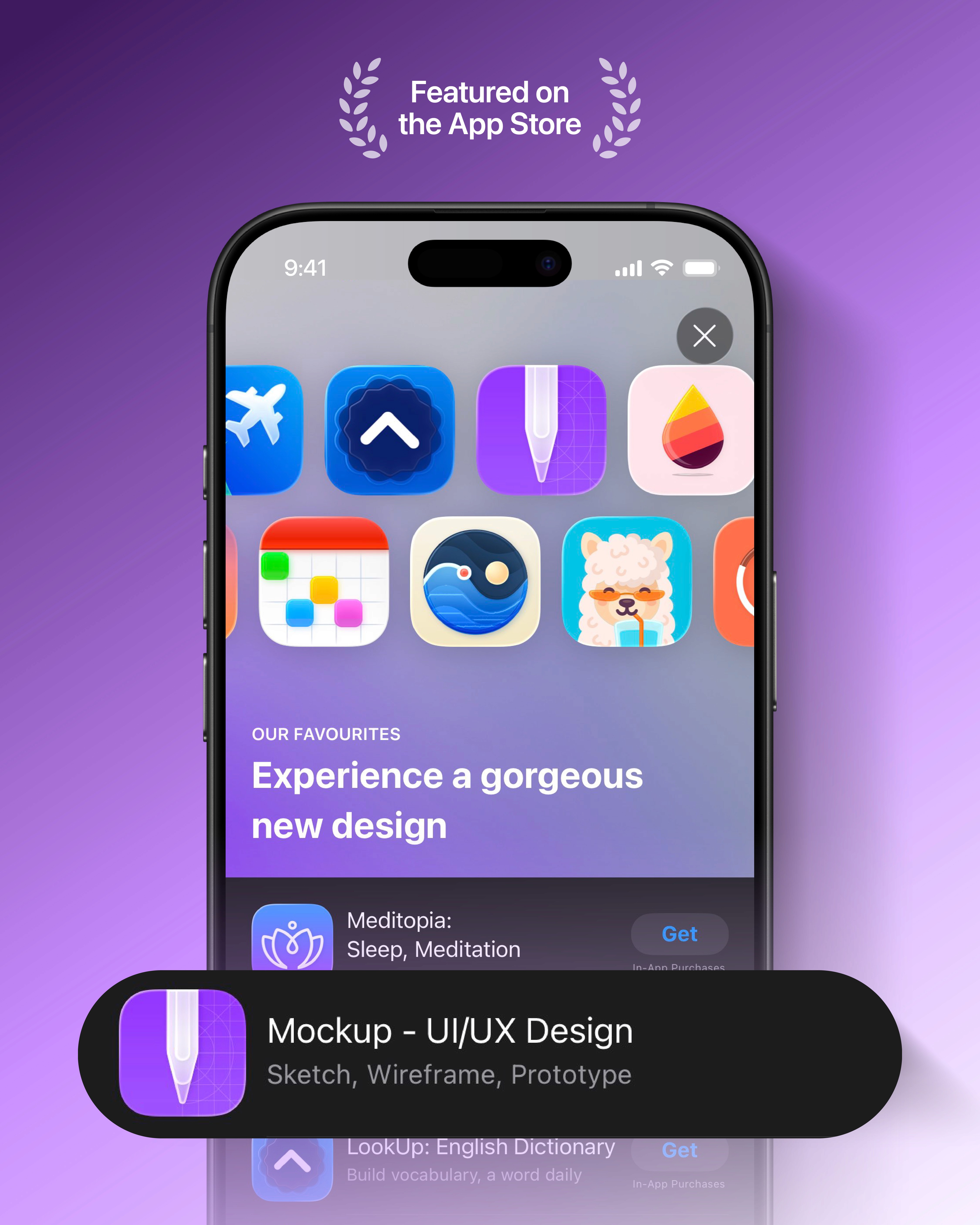
Mockup is a native iOS, iPadOS, and macOS design tool used by over 636k designers to sketch, wireframe, and prototype ideas.
As user libraries grew, the home screen became a scalability risk. I led the re-architecture of Mockup’s Home navigation to reduce friction, introduce a clear hierarchy, and keep navigation consistent across devices without compromising native conventions.
Timeline
July - September 2025
Platforms
iOS · iPadOS · macOS
Project under
Apprime Studio
Role
Product Designer
Team
1 Developer (founder & manager)

The home screen hit a structural limit
In Mockup, sketches are the primary unit of work. They can exist independently or within projects, which act as containers. Projects can also contain nested projects, creating a flexible but potentially complex structure as libraries grow.
This update initially focused on adopting the new Liquid Glass design language for the home screen toolbar.
In revisiting it, I re-evaluated how the home screen was structured as a whole, exposing its limits.

Signals that confirmed the breakdown
The issue was echoed through external feedback.
——————————————————————————————————————————————————————————————————————————————————————————--——————————--———
App Store reviews & user emails often requested
1
Better organization
2
Recently Deleted, which had no place in the existing structure
3
List view, as a way to reduce scrolling
It was the absence of a navigation model that could scale with growing libraries.
Defining the design strategy
I led a comparative analysis of native Apple apps across the iOS, iPadOS, and macOS 26 developer betas, as well as established design tools, to better understand expectations around navigation.
Clear patterns emerged.
——————————————————————————————————————————————————————————————————————————————————————————--——————————--———
Creative tools consistently separate two dominant user intents
1
Quickly resuming recent work
2
Intentionally browsing through folders
Together, these patterns pointed toward a navigation structure that separates continuation from structured browsing, while expressing the same destinations consistently across tab bar and sidebar.
The goal was to re-architect Home around a small set of primary destinations that could scale with growing libraries without increasing navigation depth.
Exploration & direction setting
Continuation and browsing became two distinct tabs.
——————————————————————————————————————————————————————————————————————————————————————————--——————————--———
The challenge was
1
Defining which internal pages should appear in the sidebar
2
Positioning Settings and Recently Deleted within the system
——————————————————————————————————————————————————————————————————————————————————————————--——————————--———
In parallel, I shaped Recents,
defining what qualifies as recent activity and how to surface sketches within projects with appropriate context
——————————————————————————————————————————————————————————————————————————————————————————--——————————--———
I reframed Settings into a primary destination,
naming it Profile based on patterns found across research, before keeping Settings as it didn't make sense in the sketch screen menu
——————————————————————————————————————————————————————————————————————————————————————————--——————————--———
Working closely with the developer,
multiple configurations were tested to determine how Recents, Browse, and its internal pages should behave across tab bar and sidebar without duplication
——————————————————————————————————————————————————————————————————————————————————————————--——————————--———
Further refinements focused on
how pages containing sketches and projects combined, such as individual projects and recently deleted, could avoid becoming another navigation layer
These iterations clarified the limits of the model before it was formalized in the final system.
The navigation system
Home was restructured into three primary destinations, expressed through a tab bar on iOS, a tab bar that expands into a sidebar on iPadOS (collapsing back to a tab bar in compact or split-screen layouts), and a sidebar on macOS.
——————————————————————————————————————————————————————————————————————————————————————————--——————————--———
Recents
A gallery for continuing work quickly. It surfaces sketches directly, including those inside projects, with subtle context indicators.
——————————————————————————————————————————————————————————————————————————————————————————--——————————--———
Browse
A structured destination organized into titled sections: - Projects - Sketches - Utilities Projects and Sketches present a limited, sorted preview, with dedicated destinations, All Projects and All Sketches, for full collections. “All Sketches” includes only loose sketches. Sketches within projects and nested projects remain accessible only through their parent container. Utilities include Recently Deleted, which combines deleted projects and sketches within a single recovery surface.
——————————————————————————————————————————————————————————————————————————————————————————--——————————--———
Settings
Integrated as a primary destination within the same navigation model.


Impact
——————————————————————————————————————————————————————————————————————————————————————————--——————————--———
11%
Relative increase of active users creating sketches
——————————————————————————————————————————————————————————————————————————————————————————--——————————--———
10%
Relative increase of active users creating projects

Only publicly released work is shown. Internal explorations remain confidential.
Mockup is a product of Apprime Studio. All designs and trademarks belong to their respective owners.
